We've been working hard to make taking off plans a whole lot easier! While we've kept the basics the same, you'll now have an easier time selecting, moving and editing your measurements.
Interaction changes
We've made navigating the plan and editing measurements much more intuitive. Here's a summary of the changes;
- You no longer need to press "space" while navigating/panning the plan. You can simply press the left mouse button and drag, even while measuring. (Pen and Eraser tool still require holding space)
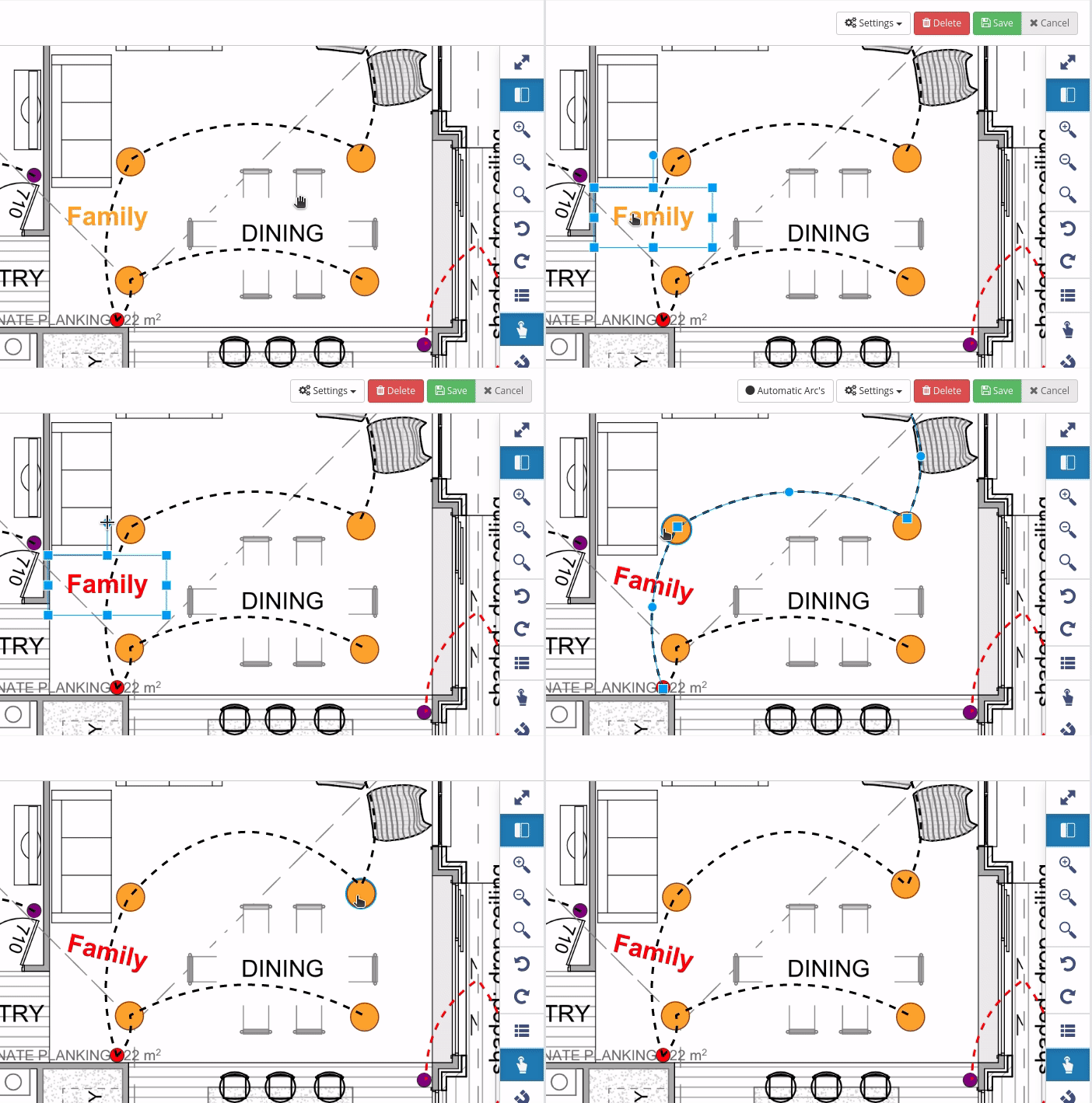
- Every measurement and markup on the plan is selectable with one click by default. Just click and start editing straight away. The "Stages" menu on the left will also automatically scroll you down to the selected Measurement so you know what you're editing.
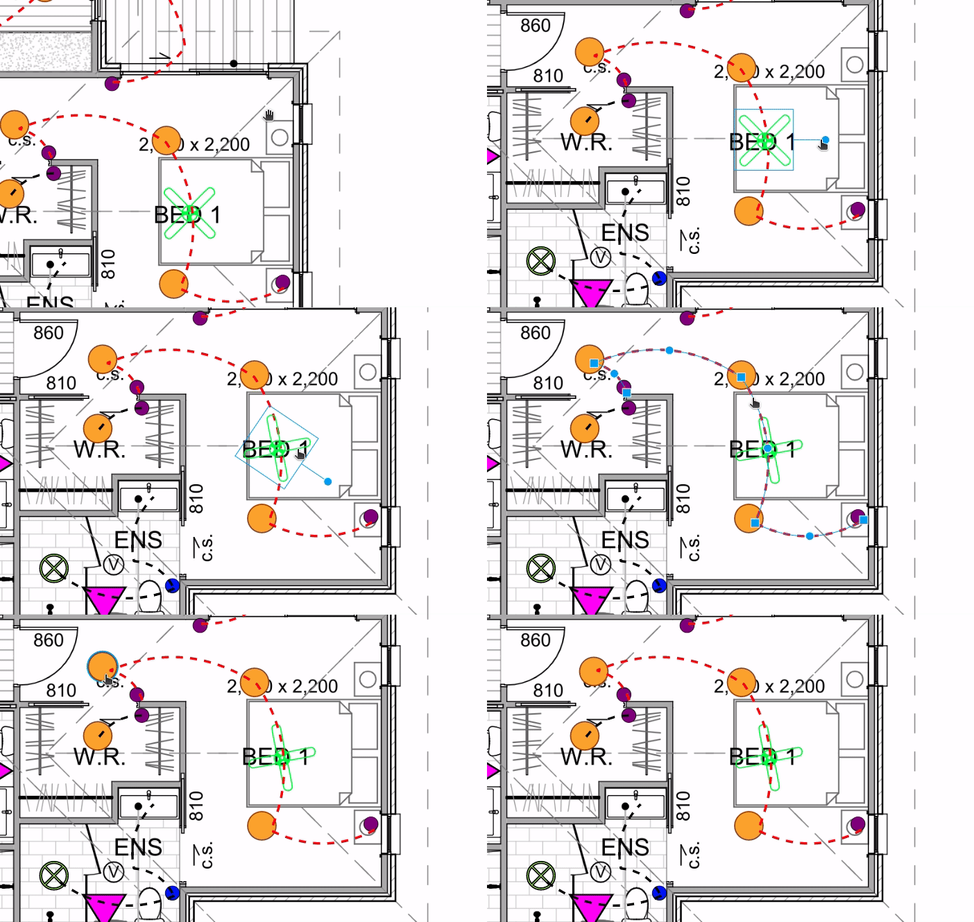
- We've added the ability to move any measurement or markup by selecting it and dragging across the plan.
- There is now a "rotate" control on all annotations and symbols. When selected, press (left click) on the blue circle on top of the object and drag your mouse in a circular motion. This also means you can rotate individual counts/symbols quickly and precisely.
Much better tablet support!
This is still work in progress, but Groundplan now works great on your latest iPad or Surface Pro. Give it a try and let us know what you think!

Global Undo/Redo
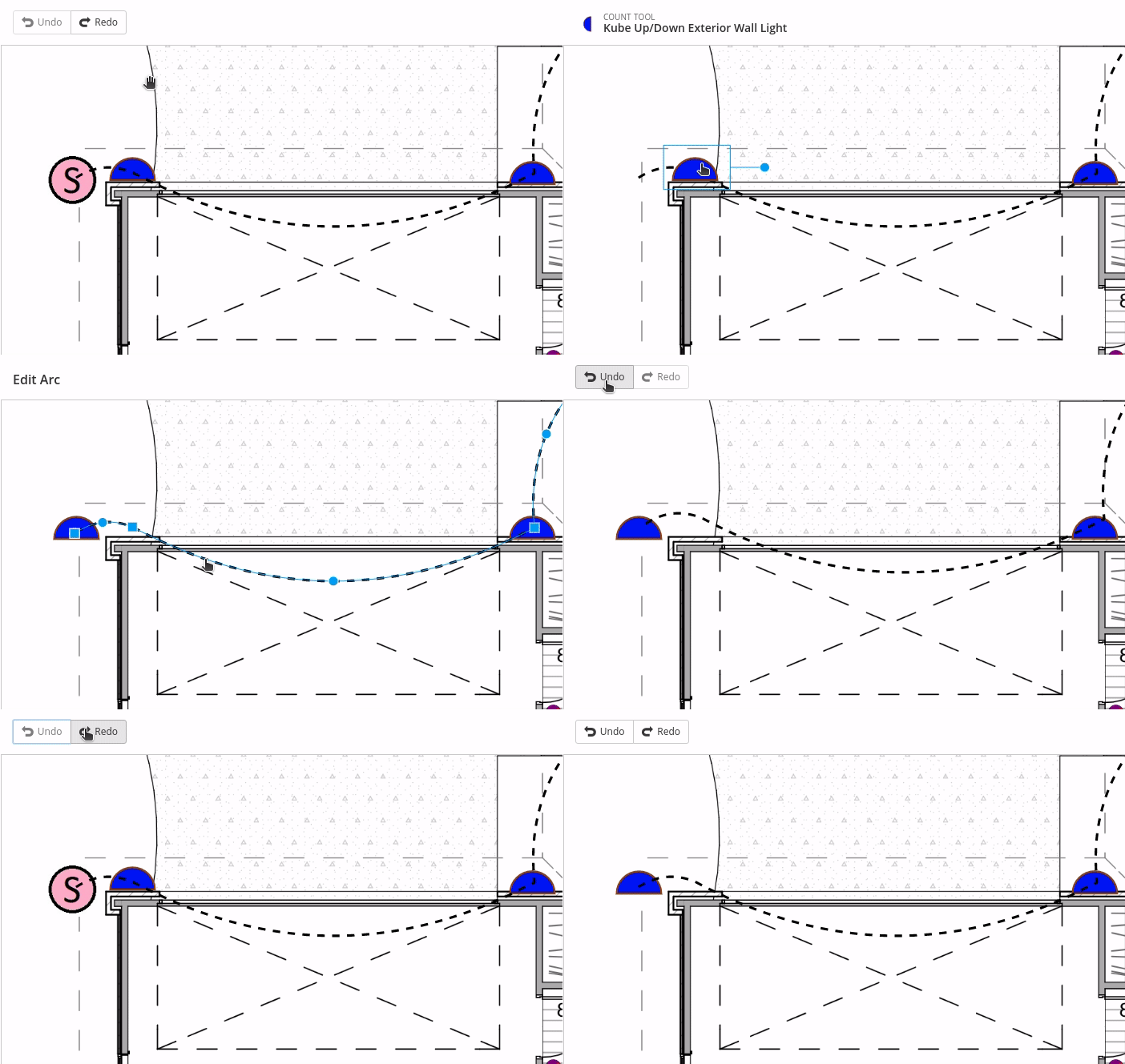
We've added plan wide "undo/redo" functionality, so if you add, delete or move a measurement by mistake, you can either press "CTRL+Z", or click the "Undo" button on the top bar. Please note it won't undo deleting a whole "Measurement" from the left "Stage" menu yet.

Note: Once you navigate out of a plan (e.g.: go to a different page, different plan, or close the browser) your “Undo/Redo” list will be erased. This means that you can only Undo/Redo actions that you’ve done since you have opened the plan.
Visual Changes
You'll also notice a few visual changes;
- We've added new "mouse over" effects, so you know which measurement will be selected before you click.
- The measurement controls are now blue and should be more visible and easier to use. We're constantly improving this so please let us know what you think.
- Small changes to the top toolbar. It now has a "white" background rather than "green" and it's more consistent, with a new "Settings" button on most tools, next to the "Save" button. This will open a menu with all the settings for whichever tool you have open at the time.
- Right toolbar visual refresh - We've made the icons larger and the bar more compact for ease of use with tablet devices.

Behaviour Changes
Although we have kept the interactions very similar to the previous editor, one of the main changes is that pressing the "ESC" key while editing a measurement now saves whatever changes you've made, rather than reverting. This shouldn't be an issue as you can now use the "Undo" button if you make a mistake. It also means you can simply press "ESC" to exit and save, rather than having to click the "Save" button.
Coming soon...
Here are a few things we're working on at the moment;
- More annotation tools (arrows, clouds, shapes etc)! Please let us know what you would like to see in Groundplan!
- Be able to select multiple measurements and markups, and move/delete them in bulk.
- Visual and User Experience improvements. These will be released gradually with the intent of making the Groundplan experience better.
...and a few more we're not ready to reveal just yet!
We're very excited to finally make these changes available to you and what this means for future development. If you need training or have any questions or feedback please feel free to email us at support@groundplan.com. We'll keep you posted with more updates!


